Defining a color theme is crucial when laying out the design system for any software application. It reflects the brand's identity and enhances the user experience through visual coherency. It forms a systematic approach that helps designers and developers standardize their focus on feature content rather than diverting their time and energy into selecting appropriate colors. Therefore, recognizing the importance of a theme in an application is indispensable for an optimized and effective design infrastructure.
Design System
- Neutral & Dark: The neutral and dark colors form the design's backbone, featuring prominently across the application. Neutral hues set the backdrop for the light scheme, delicately coloring most of the text and background to evoke a calm, clean aesthetic. Simultaneously, dark hues carve out the contours of the dark theme. While neutral and dark themes often mirror each other, defining separate patterns sharpens the design flexibility. It opens the door to individually fine-tuning each theme according to the brand's evolving needs. Neutral colors come in many shades, encompassing grays, beiges, creams, browns, and blacks – they offer a versatile palette upon which to base the design.
- Core Colors: The design system's core colors are primary and secondary colors. These two will anchor the design, with the primary and secondary colors being the most dominant colors, providing complementary contrast. Often overlooked, this consistency is vital for the brand's congeniality. Having too many core colors can contribute to inconsistency in the design.
- Supporting Colors: Should the design require it, carefully select a supporting color. However, remember that this color's function is purely supportive, reinforcing the primary and secondary colors. It should never overpower the two or divert visual attention from them.
- Standard State Colors: Standard states like informational, warning, success, error, and disabled are universal truths in every application, each with an intentional color to represent them. Informational color enlightens users with helpful knowledge, while warnings prepare users for potential pitfalls. Success and error colors convey the outcome of a user's interaction, while disabled flags make it clear that an action isn't possible. The classic colors are blue, yellow, green, red, and gray, but a well-thought-out color system allows easy adjustment per the brand's design language.
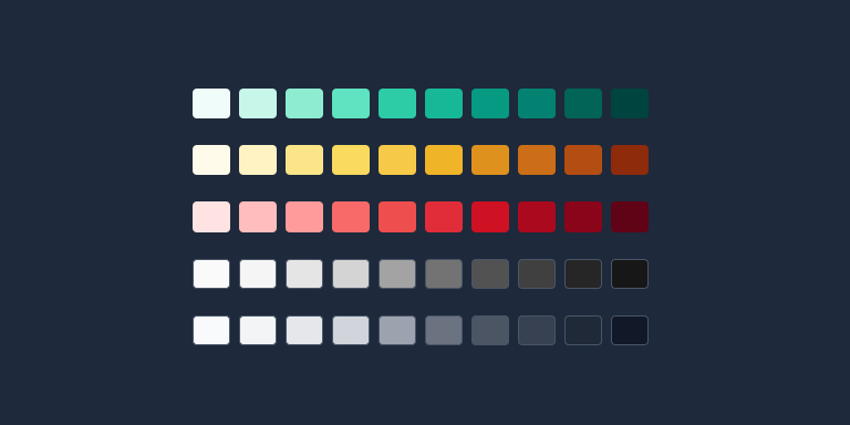
- Generic Colors: A comprehensive color design system also includes a selection of generic colors. These spare colors are valuable to define in advance, saving you from impromptu decision-making as you implement features. One recommendation is to use the default library from Tailwind CSS. It offers a broad palette that blends seamlessly with any design system.
Summary
Establishing the color design system in advance offers flexibility and ease. Once configured, it empowers you to make necessary adjustments within the scheme without needing to tweak each interface individually – a significant asset for maintaining brand consistency. Defining the theme makes it a foundational requirement for any UI Kit.