A button is a pressable component that directs users toward their desired actions, such as navigating through the application or completing specific tasks.
Design Pattern
Handlers: Handlers trigger the user's desired action.
- Default: Triggers a function when the user presses and releases the button
- Navigation: Navigation handlers can vary between platforms. Defining this early will ensure you can standardize the support for cross-platform navigation. Such as leveraging the
<a>anchor element on the web.
View States: View states of the button to provide precise feedback to users.
- Main: Standard appearance.
- Hover: Visual change when the mouse hovers over it (web only).
- Pressed: Indicates an active click or touch.
- Loading: Shows an ongoing process, preventing duplicate actions.
- Error: Signals an error in action execution.
- Success: Confirms successful completion of an action.
- Disabled: Indicates non-interactivity under specific conditions.
Styling Variants: Offer various styling options to match different design needs.
- Squared: Modern, straight edges.
- Rounded: Soft, approachable corners.
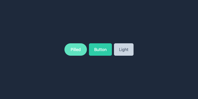
- Pilled: Fully rounded edges for a distinctive look.
- Circle: Circular for icon-only actions.
Content Options: Flexibility in button content enhances usability:
- Icons: Simplifies action communication without text.
- Text: Provides clear labels.
- Tooltips: Additional context or instructions on hover (primarily for web).
Customization: It's impossible to define all use cases, so ensuring the ability to override standard variants is important to make a reusable button component.
Summary
A well-designed button component is essential for an efficient, intuitive, visually appealing user interface. By standardizing button behavior, states, styling, and content options, you create a more cohesive user experience and simplify the development process, leading to quicker, more reliable deployment of UI components.