Intro
I've come across numerous excellent articles on the advantages of using Tailwind CSS, prompting me to concentrate on the key benefits I've experienced since its launch in 2017.
What is Tailwind CSS?
Tailwind CSS is a highly customizable, low-level CSS framework that enables rapid UI development by providing utility classes.
Key Benefits
Expressive Styling
Design System
Customizable
Cross Platform
Expressive Styling
Using utility class frameworks like Tailwind CSS allows for expressing the styles on the elements by applying the utility classes directly in the markup. This direct approach means that the displayed utility classes accurately represent how the element will render and help you visualize the styling over time.
Visualization

This streamlined approach to styling can be likened to the experience depicted in the Matrix meme, "I don't even see the code." - for many users, it becomes a matter of not seeing the utility classes but instead visualizing rounded corners, shadows, background colors, and aligned content. With the styling directly expressed on the element, there's no need to remember how it was styled, making it easy to visualize the impact of each utility class and swiftly make adjustments or apply new design enhancements.
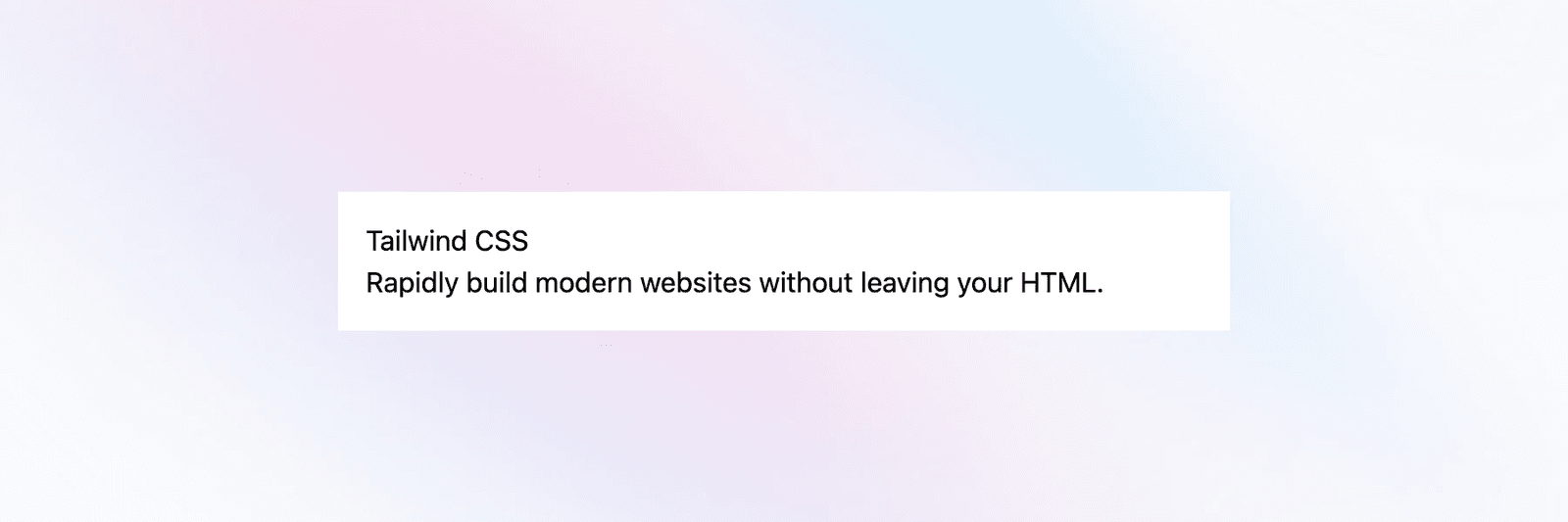
For example, let's take this plain card:
<div class="relative mx-auto w-full max-w-lg">
  <div class="bg-white p-4">
    <h2>Tailwind CSS </h1>
    <p>Rapidly build modern websites without leaving your HTML.</p>
  </div>
</div>
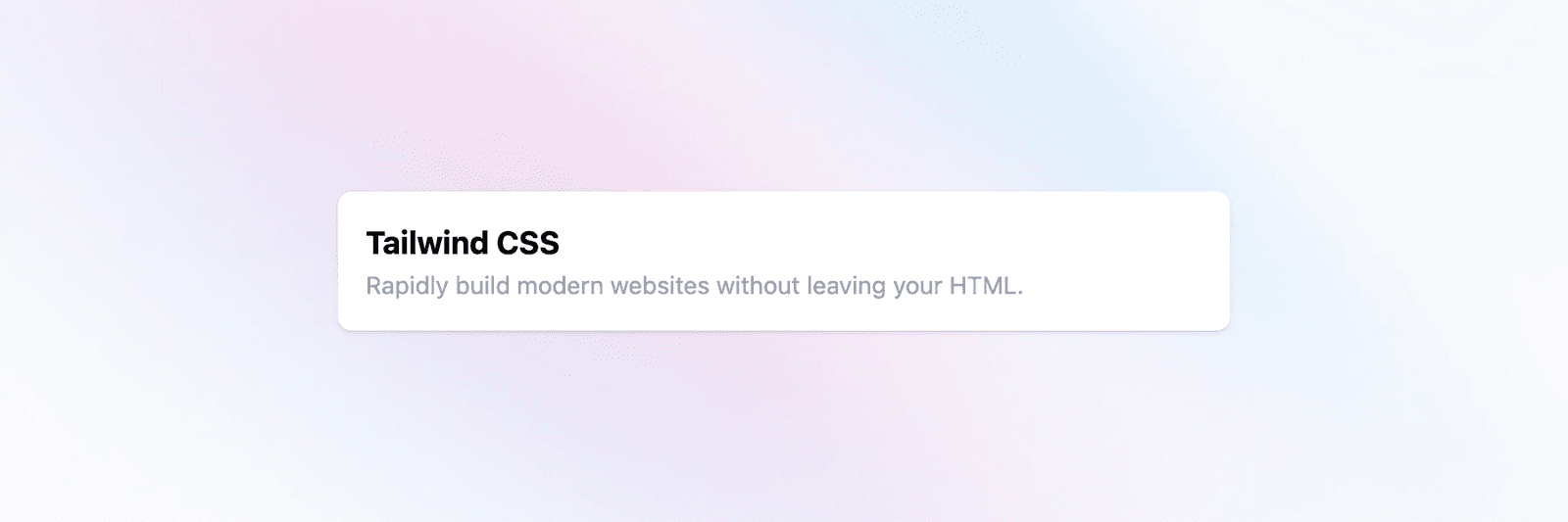
Let's add text styling to the title and description and round the edges with a shadow.
<div class="relative mx-auto w-full max-w-lg">
  <div class="bg-white p-4 rounded-lg shadow">
    <h2 class="font-bold text-lg">Tailwind CSS </h1>
    <p class="text-sm text-gray-400">
      Rapidly build modern websites without leaving your HTML.
    </p>
  </div>
</div>
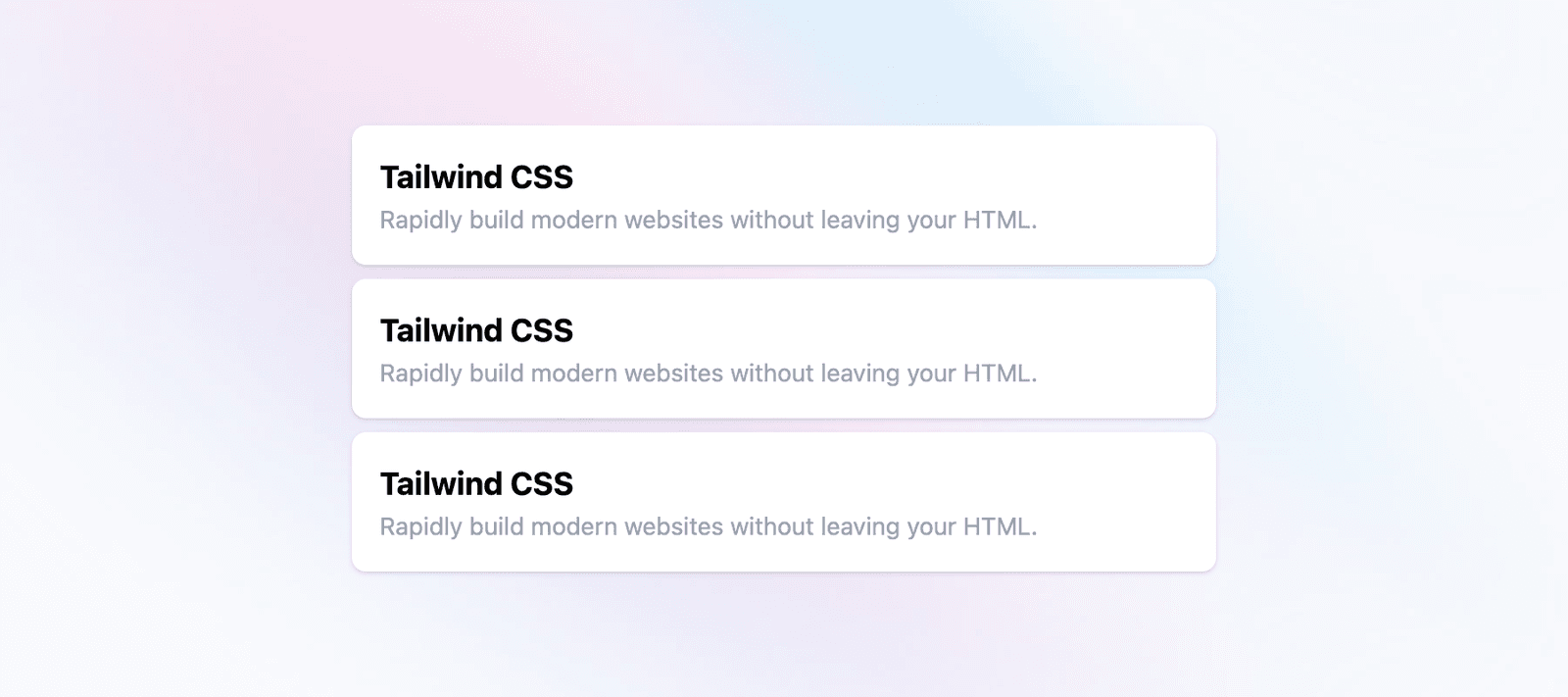
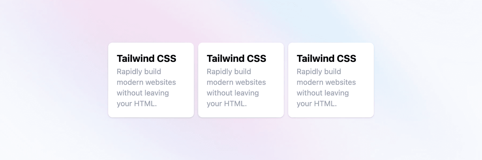
Responsive Design
Tailwind CSS enables the expression of responsive design without the complexity of traditional CSS media queries, which can be challenging to manage in large applications. This simplifies creating responsive layouts and ensures a more intuitive approach to handling responsive design needs.
For example, we can express a vertical list on mobile screens and a horizontal list on larger screens without leaving the markup expressing those styles.
<div class="lg:flex lg:flex-row lg:items-center space-y-2 lg:space-y-0 lg:space-x-2 relative mx-auto w-full max-w-lg p-2">
  /* child cards */
</div>
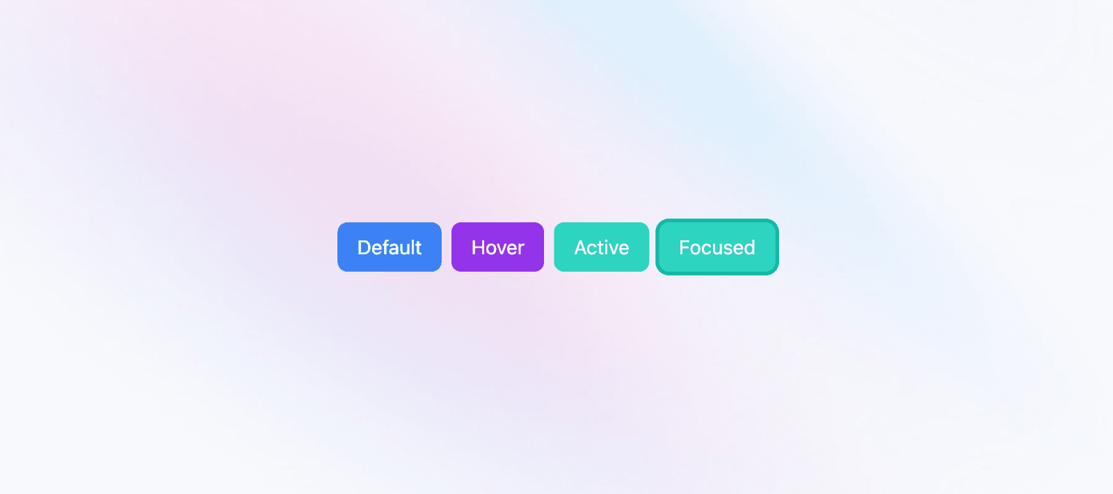
User Interaction States
In addition to responsive design, Tailwind CSS allows for expressing user interaction states such as hover, active, focus, and more. This functionality provides insight into how an element will look when rendered and how it will appear during user interaction, offering a comprehensive understanding of the element's behavior and appearance across different states.
<button class="hover:bg-purple-600 active:bg-teal-400 focus:ring-teal-500 focus:outline-none focus:ring bg-blue-500 text-white rounded-lg px-4 py-2">
  Click Here
</button>
It's Faster
Tailwind CSS is faster because it lets you style elements quickly by directly applying utility classes to the markup. This means you don't have to search for styling markup or worry about unintentionally affecting other elements globally when making styling changes to individual elements.
Design System
A design system is a standardized framework that efficiently manages design at scale by minimizing duplication, establishing a common language, and ensuring visual uniformity within an application. This definition encapsulates the essence of Tailwind CSS, as it actively promotes an API for your design system. Tailwind achieves this through its set of utility classes, which facilitate consistent styling across the application and help maintain visual coherence per the configuration that defines the design system. This enables you to operate within the confines of a system instead of cluttering your stylesheets with random values. Tailwind CSS simplifies maintaining consistency in color choices, spacing, typography, shadows, and other essential elements, constituting a well-structured design system.
Customizable
Tailwind CSS is highly customizable through the tailwind.config.js file. You can easily extend the existing utility classes or add your API. This enables developers to tailor their applications to suit their specific design system and functionality requirements.
For example, I typically change up the breakpoints and add primary and secondary colors to make changing themes within an application easy.
export default {

  theme: {
    /* this adds the ability to target screens below a max width */
    screens: {
      xs: "420px",
      "below-xs": { max: "419px" },
      sm: "640px",
      "below-sm": { max: "639px" },
      md: "768px",
      "below-md": { max: "767px" },
      lg: "1024px",
      "below-lg": { max: "1023px" }
    },
    extend: {
      /* this adds primary-500 and secondary-500 color variants styled through css variables */
      colors: {
        primary: {
          50: "var(--primary-50)",
          100: "var(--primary-100)",
          200: "var(--primary-200)",
          300: "var(--primary-300)",
          400: "var(--primary-400)",
          500: "var(--primary-500)",
          600: "var(--primary-600)",
          700: "var(--primary-700)",
          800: "var(--primary-800)",
          900: "var(--primary-900)"
        },
        secondary: {
          50: "var(--secondary-50)",
          100: "var(--secondary-100)",
          200: "var(--secondary-200)",
          300: "var(--secondary-300)",
          400: "var(--secondary-400)",
          500: "var(--secondary-500)",
          600: "var(--secondary-600)",
          700: "var(--secondary-700)",
          800: "var(--secondary-800)",
          900: "var(--secondary-900)"
        }
      }
    }
  }
}
Cross Platform
Tailwind CSS enables implementing a well-engineered design system, while React Native allows developers to write code once for multiple platforms. Nativewind further empowers the seamless integration of Tailwind CSS in React Native, ensuring a consistent styling experience across all platforms. This is why I rely exclusively on Tailwind CSS for its robust design system and capability to style elements across platforms.
Conclusion
Tailwind CSS has revolutionized how developers approach UI development by providing a highly customizable, low-level CSS framework with many benefits. From expressive styling to responsive design and seamless integration with React Native through Nativewind, Tailwind CSS offers a comprehensive solution for modern front-end development.
By leveraging its utility classes, developers can streamline the styling process and visualize the impact of each enhancement, leading to efficient and intuitive design implementation. The framework's support for responsive design and user interaction simplifies the complexities of traditional CSS, making it easier to create consistent and visually coherent interfaces.
Moreover, the framework's customizable nature through the tailwind.config.js file allows for tailoring applications to specific design systems and functionality requirements, promoting visual coherence and ease of theme management.
In conclusion, Tailwind CSS is a powerful tool that expedites UI development and promotes a standardized and efficient approach to design at scale, making it a valuable asset for developers seeking to enhance their front-end development workflow.